Analysis of the old design, redesign of the overall navigation
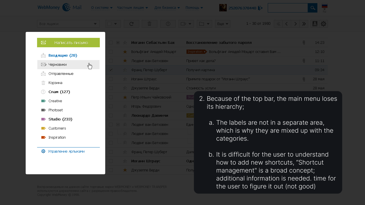
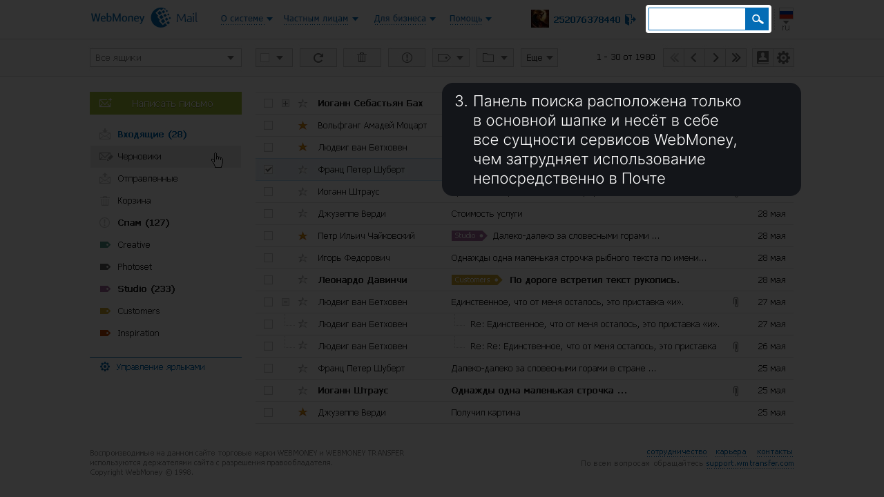
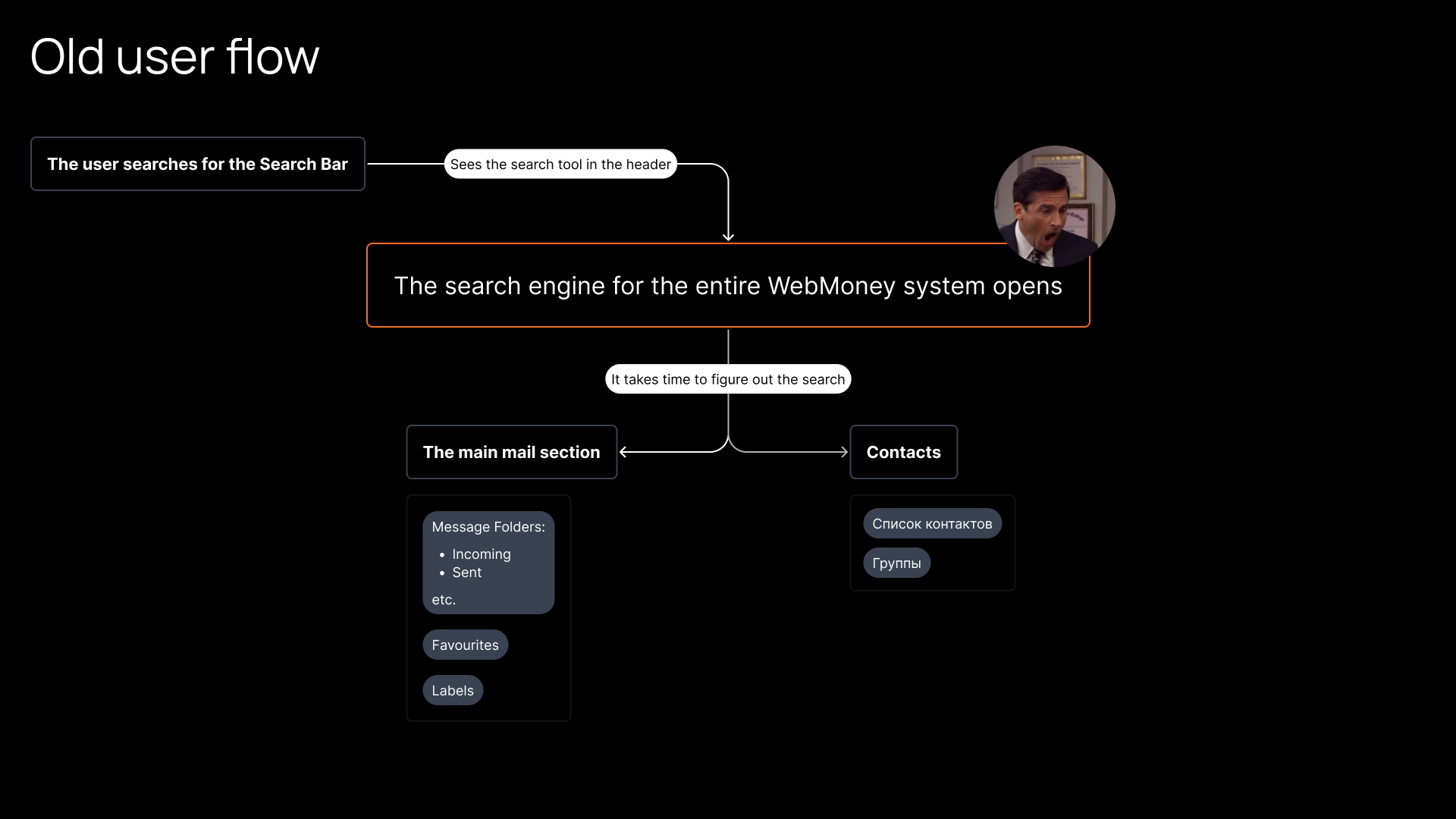
Let's take a closer look at the Search problem
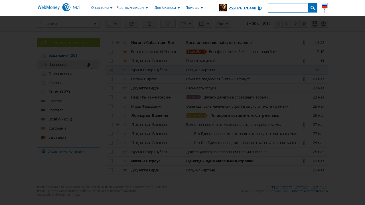
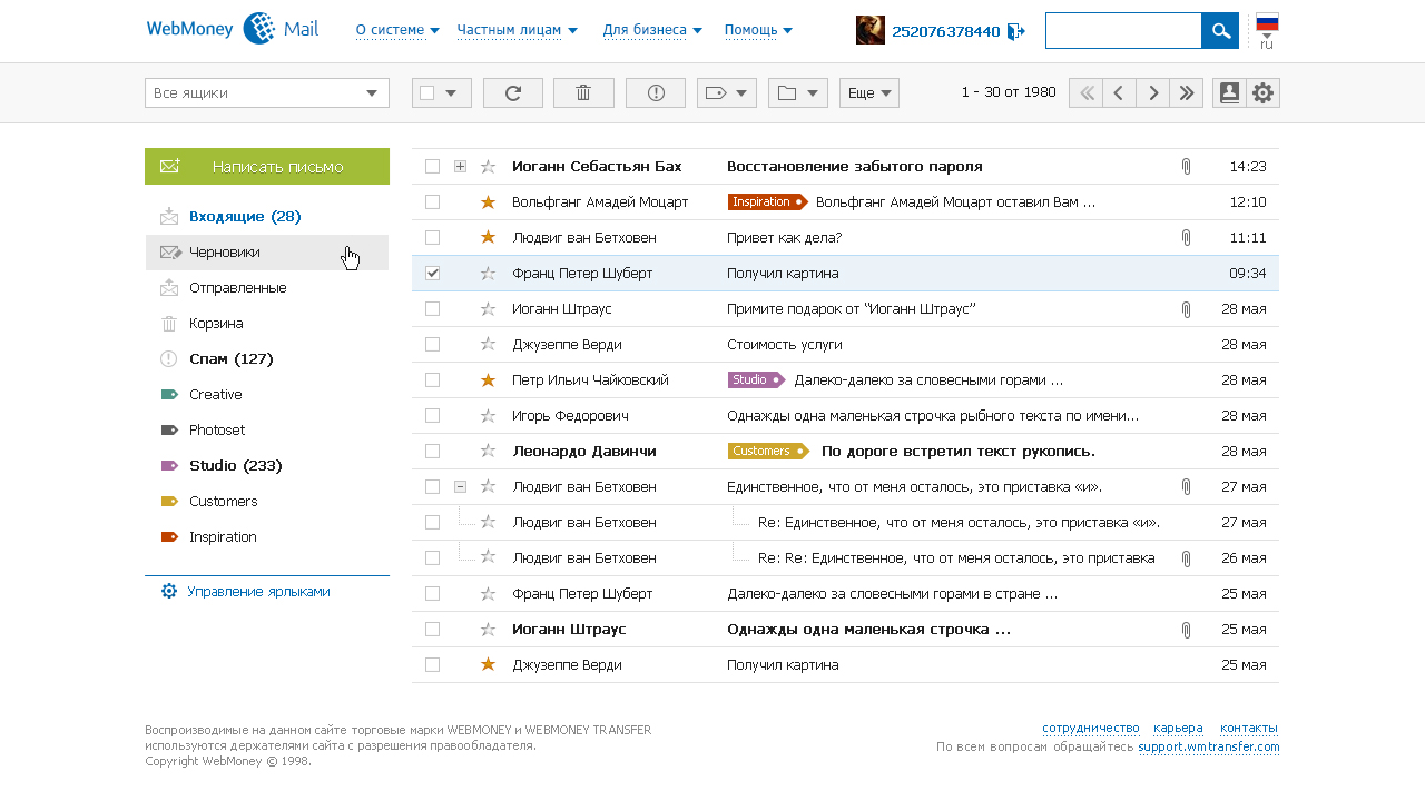
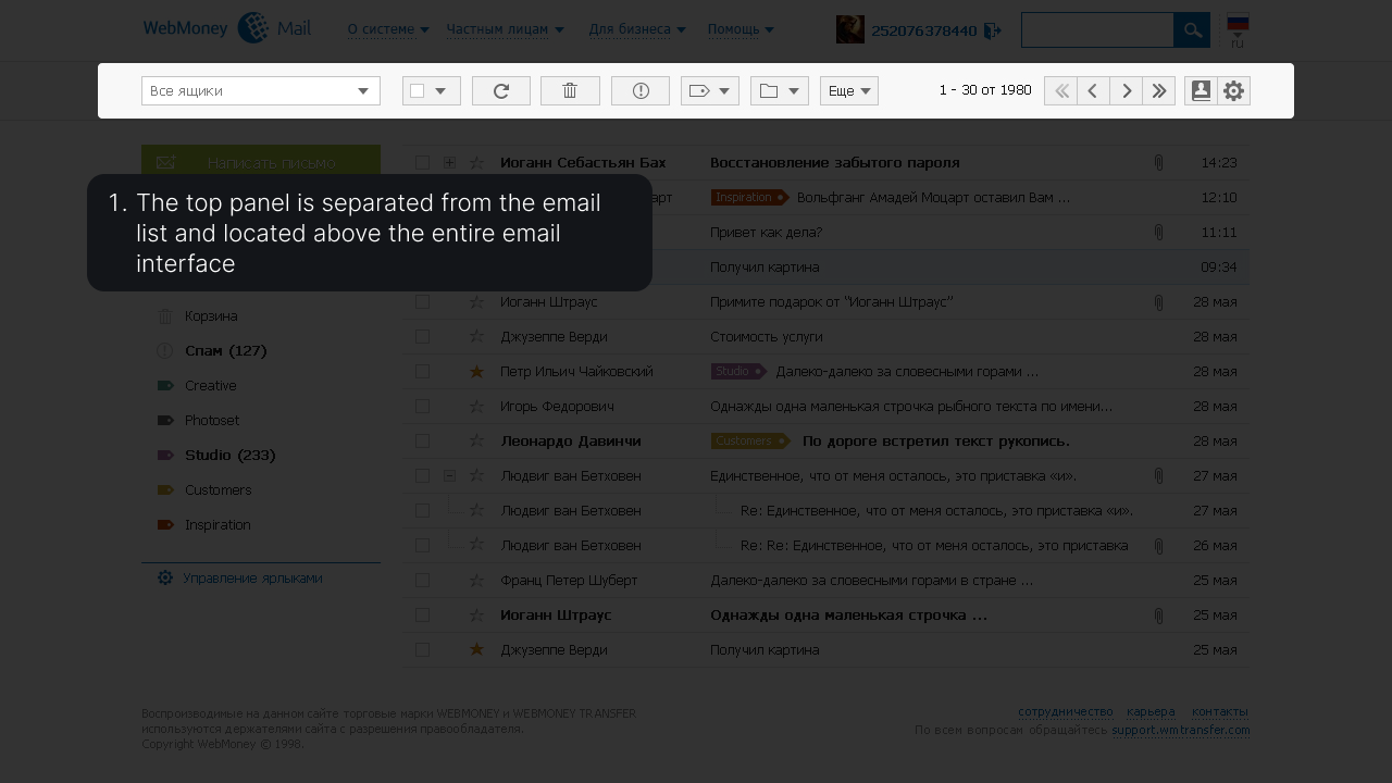
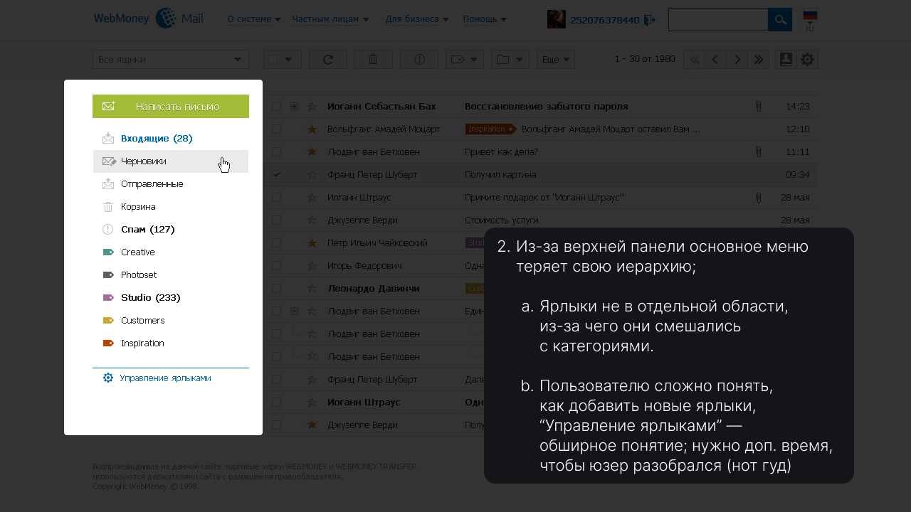
Problems
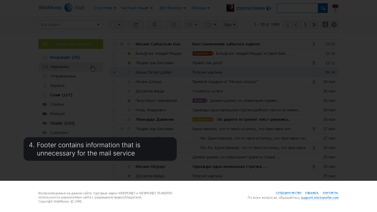
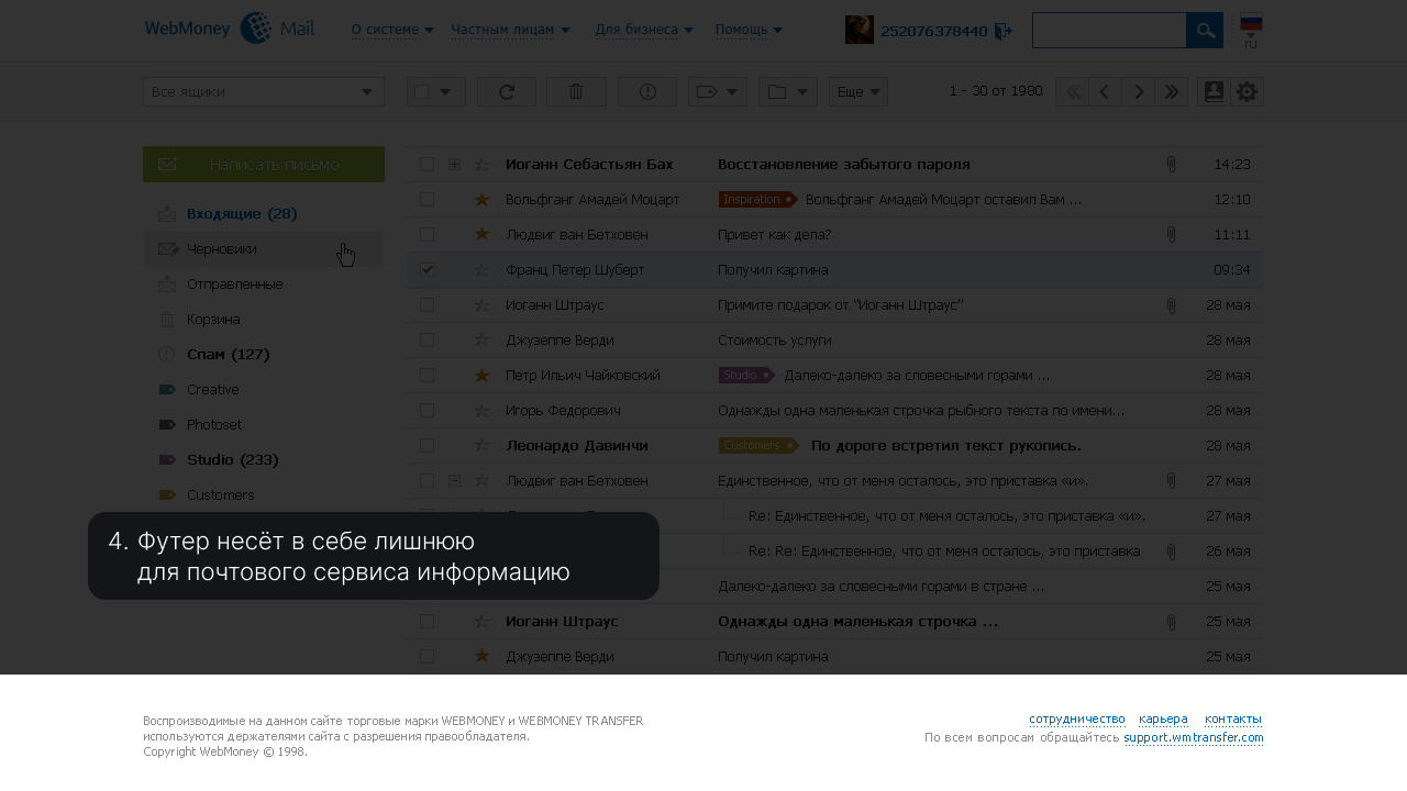
There are many extraneous menu items that do not specifically relate to email; the search is only in the header, which contains all the service entities.
Small story

Проблему общей устаревшей навигации платформы предложили решить два инициативными разработчика, которые лучше понимали подводные камни.
От нашей, дизайнерской стороны, требовалось спроектировать новую логику меню. Первым делом мы попытались узнать, что мешает бизнесу отказаться от старой структуры.
Решающим фактором были не показатели метрик. Как это ни странно, руководство (по их словам) поддерживало нагромождённое меню с длиннющими списками просто на тот случай, когда у пользователя возникнет "какой-то вопрос" и ему потребуется помощь от Поддержки.
Других метрик, которые могли объективно показать необходимость в этом, нам не смогли предоставить.
The problem of the common outdated navigation of the platform was proposed to be solved by two proactive developers who better understood the pitfalls.
From our design side, it was required to design a new menu logic. First of all, we tried to find out what prevents a business from abandoning the old structure.
The metrics were not the deciding factor. Strangely enough, the management (according to them) maintained a cluttered menu with long lists, just in case the user had a "question" and needed help from Support.
They were unable to provide any other metrics that could objectively demonstrate the need for this.

Decision
There were no resources to research the support service. Therefore, the design team decided to look at the structure of the main menu from other banking companies and implement their strengths.
Small story
Сложность внедрения нового дизайна состояла в том, что каждому разработчику, который отвечает за определённый сервис, нужно было дать уже готовый код. Стороне фронтенда требовалось создать код, с готовыми стилями, который можно было бы подключить к файлу любого сервиса и просто поменять / добавить в нём нужные ссылки и названия. По-другому сценарию никто не хотел идти, а финальное решение наша сторона не принимала.
Но, в итоге, всё получилось :)
The difficulty of implementing the new design was that each developer responsible for a specific service had to provide ready-made code. The frontend side needed to create code with pre-defined styles that could be connected to any service file and simply modified or added with the necessary links and names. No one wanted to follow a different approach, and our team did not make the final decision.
However, in the end, everything worked out :)
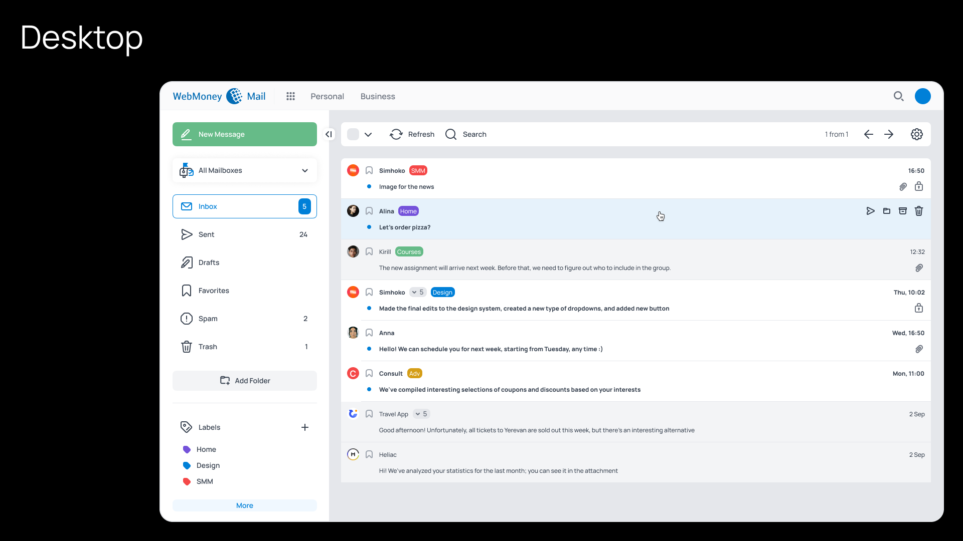
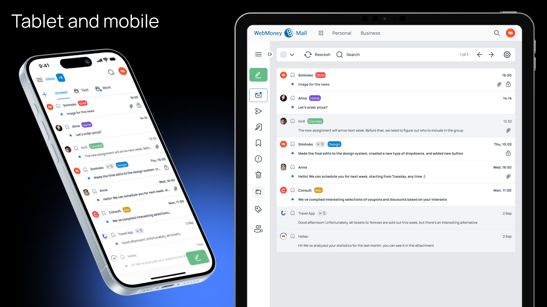
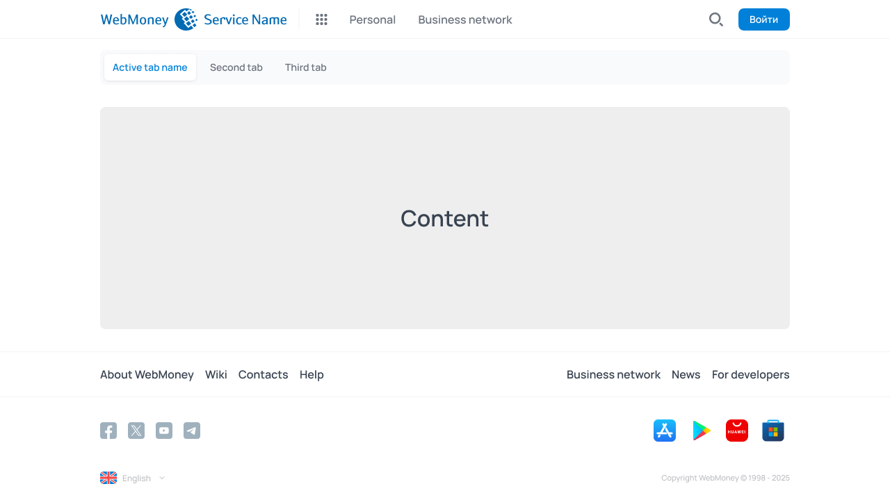
The main goal of the navigation panels update was to move from the "everything is always available in one place" strategy to "providing solutions based on the context".
The menu became contextual, native, and all the platform's features remained at hand, organized into categories within the horizontal menu. A unique second-level horizontal menu could be added to each Service as needed.
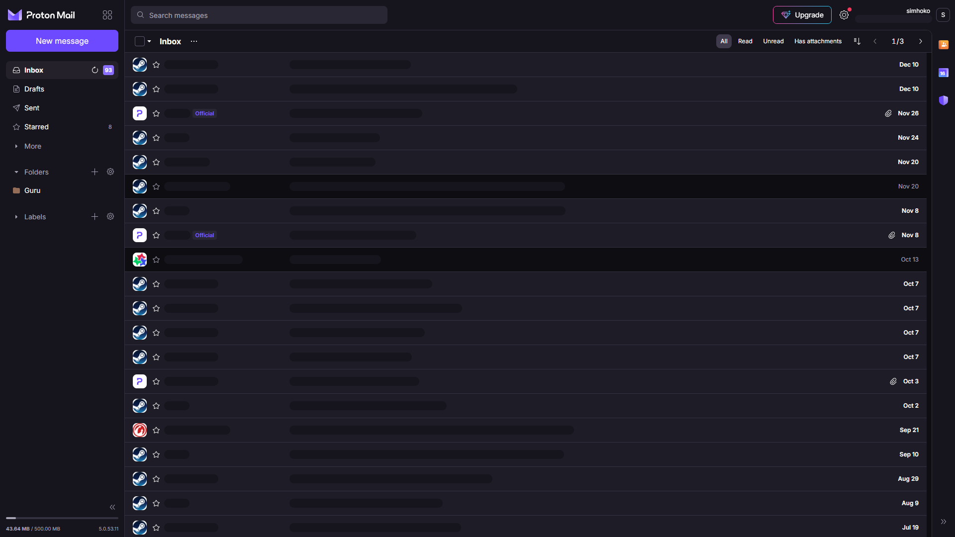
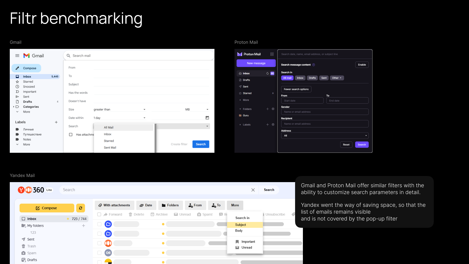
Benchmarking
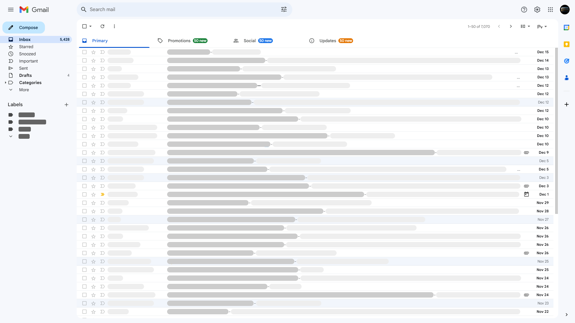
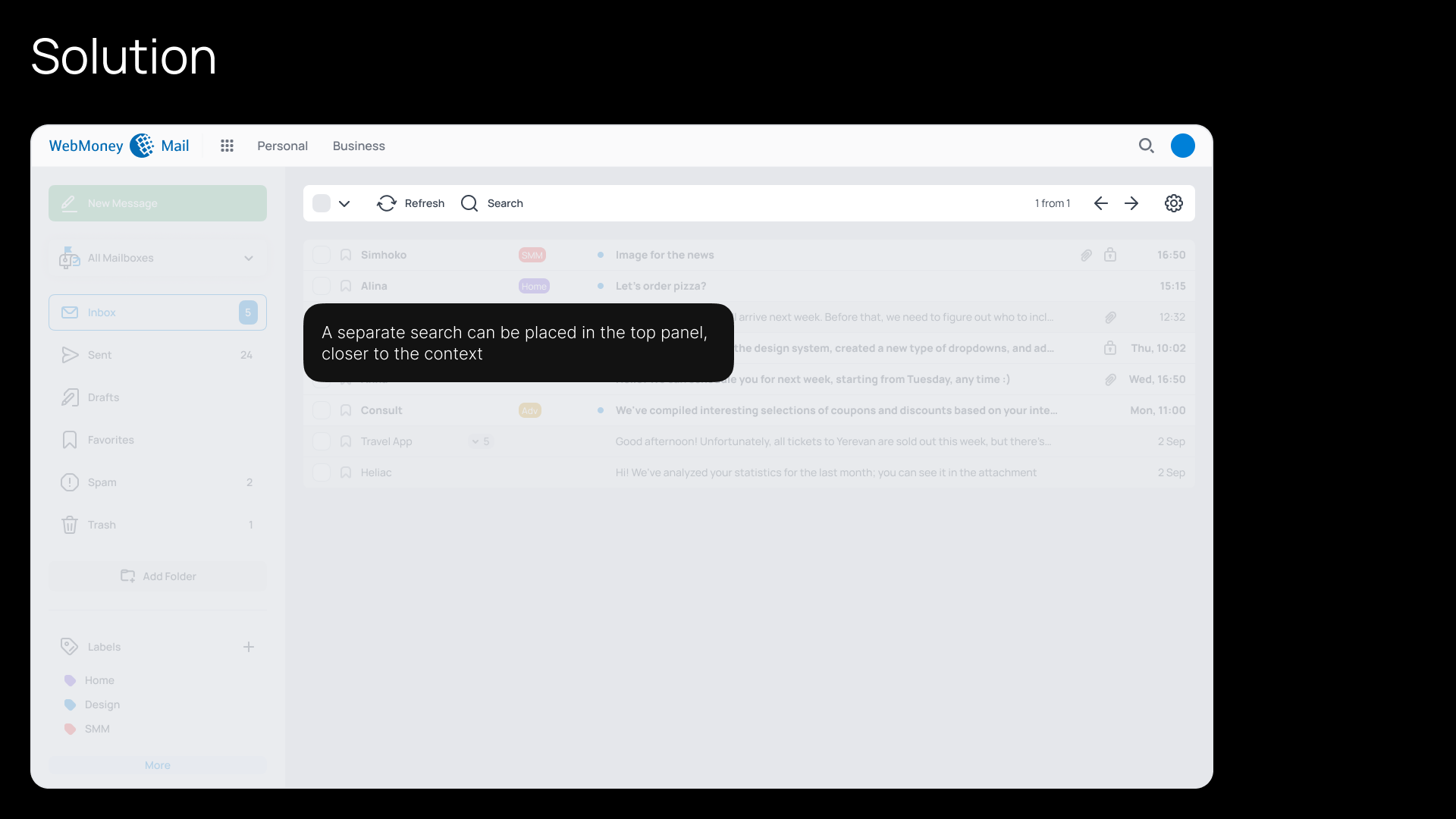
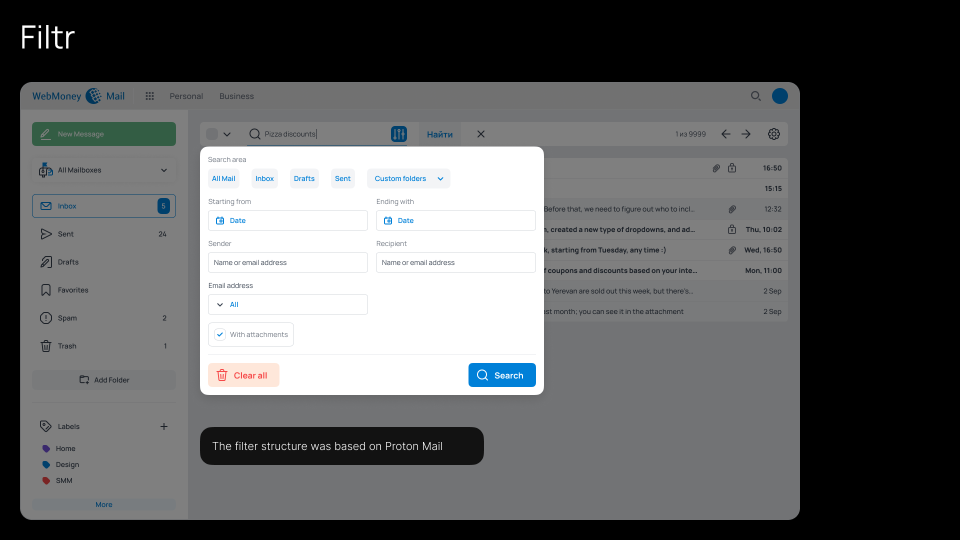
After several discussions with the team and design iterations, a new search filter was added to the Mail interface
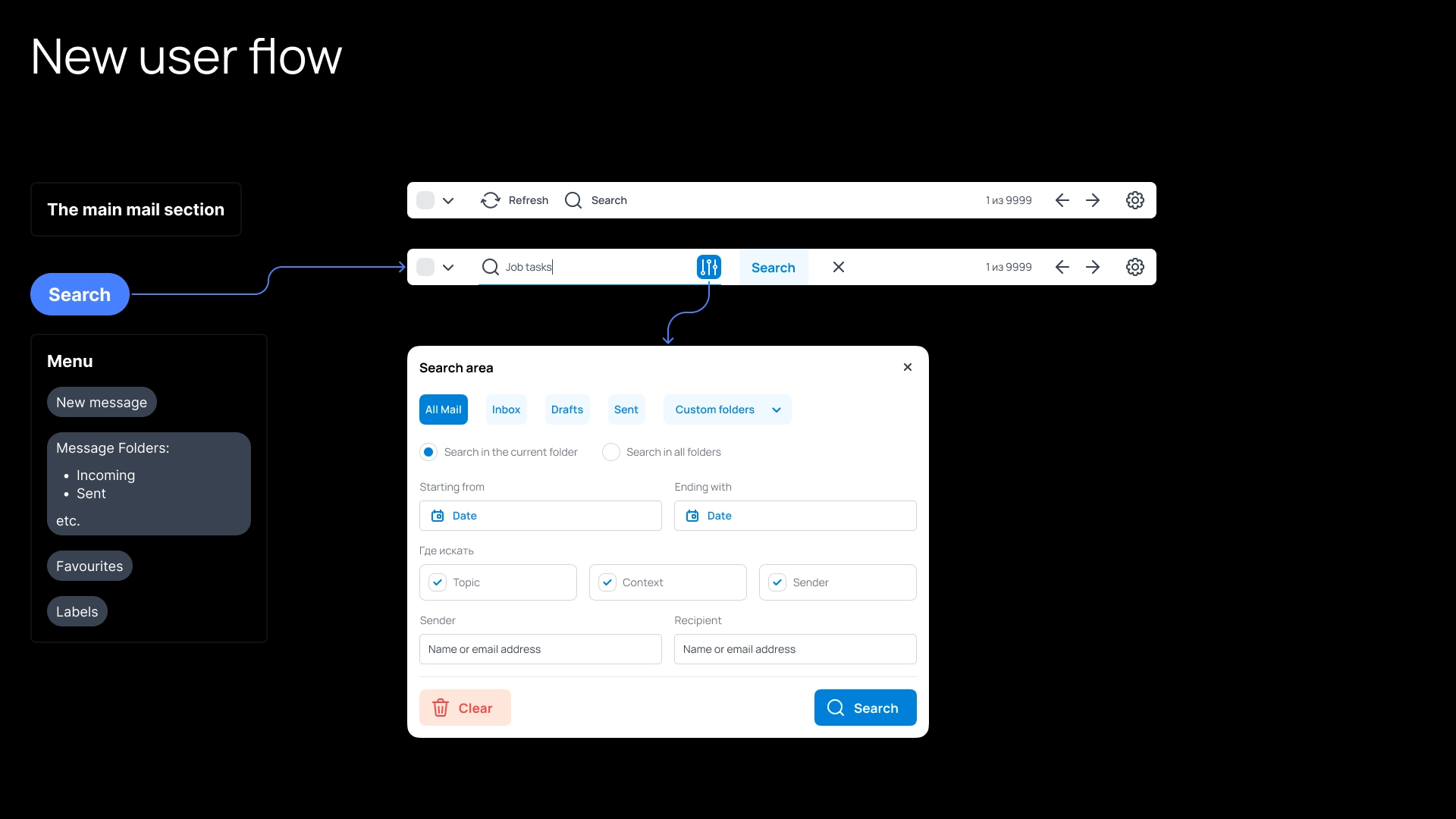
Decision
Implement a separate Search Form with Filters;
Separate the main search engine from Contacts and give them a separate